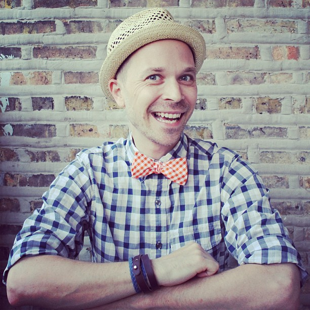
Captain Dapper is rolling up his sleeves and taking a DIY approach to a new logo and banner.
You may have noticed the new logo and banner at the top of the blog. I'm still playing around the design for Captain Dapper and, as such, I've been changing things around on whims. I've been thinking about creating a new logo and banner for awhile, something that better represents me and my style. Yesterday, I grabbed the Mister and forced him to play photographer while I mugged around for a bit, hoping to get a few head shots that I could use here on the blog. In the photo above I'm giving I'm-too-mired-in-ennui-to-care-about-your-silly-photograph realness.
And this is my by-golly-it's-good-to-see-you face. Obviously this photo could never be used on top of the blog because it makes me look like I have more crow's feet than Methuselah. (If you follow me on Instagram, you already saw these two poses.) I knew I wanted to put a shot of me in the middle of my new banner but I wanted it to hit just the right tone. I ended up going with this pose:
I think it says hello-I'm-here-to-help-you-be-more-stylish-and-happy. It also says I like to mix patterns. And that I love a good hat.
Once I selected this photo, I deleted the background so it was just me on a transparent base. Then I created a little frame in Photoshop.
Full disclosure: it took me almost two hours to create this frame. I got halfway through one version of it and then deleted the whole thing because it wasn't coming off right. Then I tried a different approach and, about an hour later, came up with this ring of interconnected C's and D's. (For Captain Dapper, natch.) With my frame created, I dropped myself into it. Well, actually, I first flipped the frame from portrait orientation to landscape and then I dropped myself into it.
From here I played around with different layers, shading and fonts to create the banner you see up top. I started off clean and simple - just me, the frame and the name.
When I dropped that onto the top of the blog, however, it seemed a little meh. So then I
That's when I started playing around with borders and horizontal lines. I felt like I was getting closer but it still didn't look quite right.
Ok, now we're getting close. I introduced a second font to the banner (the same font used in the thumbnails on the right side) and tweaked the transparency level of the text and lines. And then, on the 13th version of the banner, I felt satisfied:
Yes, it's a little fussy. And, no, it doesn't really match the thumbnails that run down the right side of the page. That's what happens when amateurs design blogs. But it's a hell of a lot better than the ugly half-assed logo I was using and, well, it has yours truly in it so it can't be all bad, right?
Images: Jason Loper


No comments:
Post a Comment